
Beyond 4.7 stars: social listening and review analysis at the Louvre

Barbara Houdayer
Head of Marketing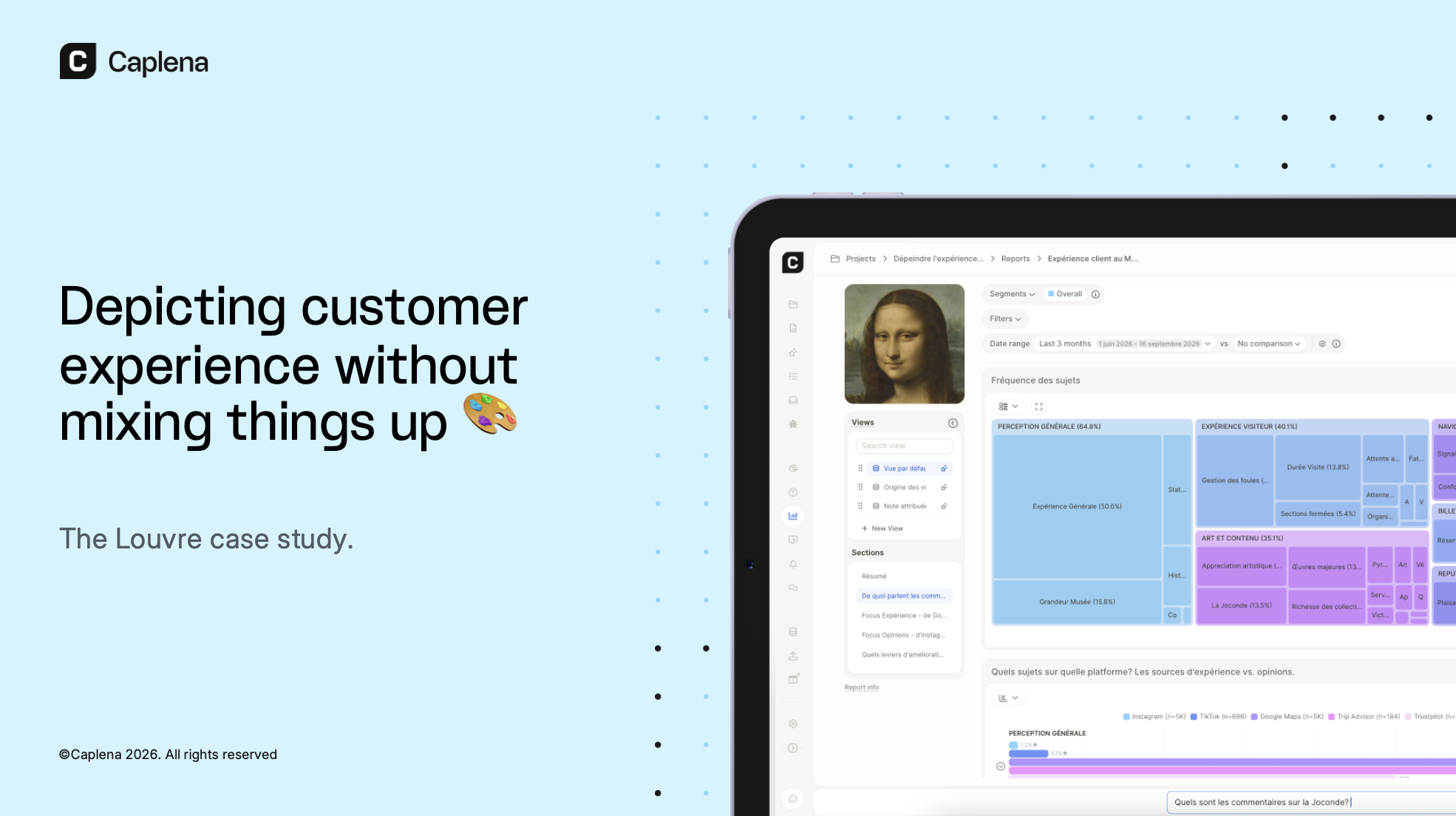
Your customers talk about you everywhere: in surveys, on review sites, in Instagram comments and TikToks. Yet most teams still analyze each source on its own, with its own dashboard, owner and monthly meeting.
In my talk at Printemps des Études 2026 in Paris, "Depicting customer experience without mixing things up", I showed what changes when you bring these sources together, using the Louvre as a case study.
Why did I pick Le Louvre? It offers huge volumes of feedback and colorful comments covering visitor experience, a famous heist and pop culture. It's also a landmark where I spent many Sundays as a student who grew up far away from Paris.
Here's what more than 100,000 comments from six platforms revealed.
Some observations before we start:
While people rate the Louvre 4.7 stars on Google Maps, about 1 in 9 of the 4–5-star reviews including text has negative sentiment.
Experience topics make up 89% of mentions on review sites, but less than 10% on Instagram and TikTok.
The jewel heist appears in 9.6% of social media comments, against 0.4% on review sites.
Why a 4.7-star rating hides visitor friction
With 377,000 reviews and a 4.7-star average, Google Maps looks like the obvious place to start.
We analyzed the 27,009 reviews posted since September 2025, which average 4.63 stars. At first glance, visitors are delighted: 91.5% give 4 or 5 stars. But 57% of these ratings come without any text, and 11.6% of those with text have negative sentiment. As one high-rated review puts it: "Everything as expected, somewhat difficult to navigate but easily possible to see everything we wanted to."
Topics mentioned negatively are mostly operational: crowds (a complaint in 5.6% of 4–5-star reviews), wayfinding and closed sections. Summer 2026 added a heatwave, with almost unanimously negative mentions (net sentiment −95). Complaints about closed sections rose in the weeks after each heat spike, and 43% of the year's mentions fall between June and August. One visitor shared "We got an email saying the museum would close at 4pm (rather than 9pm), no refunds or exchanges". Another wrote: "because of the heat wave, the Egyptian section was closed."
Stars tell you whether visitors liked the Louvre. But they don't reveal what got in their way.
Adding review sites and social listening
To get the full picture, we combined six platforms in one Caplena project:
Online review sites (Google Maps, TripAdvisor, Trustpilot, Yelp): review text for the "Louvre" location in Paris.
Social media (Instagram, TikTok): posts and comments containing #Louvre, excluding content about the Louvre Abu Dhabi.
That's 124,823 comments from September 1, 2025 to September 24, 2026. Caplena's AI coded them into 12 categories and 87 topics, using the same topics for every source and keeping each platform as a filter.
Social posts have no star ratings, so net sentiment comes as a handy comparison metric. Net sentiment is measured as the share of positive comments minus the share of negative ones, on a scale from −100 to +100 following the same principle as NPS. Each comment is classified as positive, negative, or neutral based on its content and the topics assigned to it.
| Platform | Comments | Net sentiment |
|---|---|---|
| Google Maps | 27,009 | +41 |
| 84,095 | +20 | |
| TikTok | 12,958 | +22 |
| TripAdvisor | 628 | +12 |
| Trustpilot* | 76 | −80 |
| Yelp* | 57 | +30 |
*Fewer than 100 comments: indicative only.
Google Maps is the happiest channel, while TripAdvisor is tougher (36% negative comments). And noise matters: 58% of TikTok mentions are off-topic (emojis, tags, spam), so filtering comes first.
Blind spots of a Google Maps-only analysis
Comparing topics by platform reveals two layers.
On review sites, 89% of mentions describe the experience itself: the visit, the art, navigation, tickets and staff.
On Instagram and TikTok, that share drops below 10%, and reputation and news take over (36% of Instagram mentions and 30% of TikTok mentions, against 3% on review sites). Off topic content was clearly identified and split into subcategories (including emoji-only, tag to follow, fan content, politics, association to other landmarks and places) for analysis and filtering.
In short: review platforms give you experience data, and social media adds a layer of opinion and digital culture.
Even on shared topics, Google Maps paints a rosier picture than the other five platforms:
| Net sentiment | Google Maps | Other platforms |
|---|---|---|
| Staff competence | +4 | −47 |
| Staff friendliness & welcome | −14 | −58 |
| Pricing | −32 | −75 |
| Building condition | +20 | −86 |
| Security | −53 | −92 |
Sometimes both layers meet in a single post. In this Instagram reel, parents in front of the Louvre film their child rolling on the floor, which found an echo as part of the "chic crisis" (perrengue chique) trend in Brazil, poking fun at the luxury of having a tantrum in Paris. It's a visitor experience story told in the language of pop culture, and no review site would capture it.
Social listening on TikTok vs. Instagram
The October 2025 jewel heist dominates both platforms. But they tell different stories about what the Louvre stands for.
TikTok is the comedy club. Comments are short, ironic and borrowed from heist fiction: "It was them. I just cant prove it. Professor has the blueprint." Memes and jokes score a net sentiment of +76.
Instagram is the newsroom. Serious topics come up five to six times more often than on TikTok:
| Share of comments (net sentiment) | TikTok | |
|---|---|---|
| Security | 5.0% (−93) | 0.9% (−75) |
| Government & museum leadership | 0.7% (−88) | 0.2% (−67) |
| Restitution of artworks | 2.3% (−50) | 0.4% (−58) |
Comments read like guest columns ("professionals: the burglars, and amateurs: the Louvre, the Police, the French Government") or calls for restitution ("get your louvre artifacts back!"). Instagram also carries a luxury and celebrity layer, led by Louis Vuitton's Spring/Summer 2026 show at the Louvre during Paris Fashion Week.
The audience mix is nearly identical, with about 9 in 10 comments on both platforms coming from international audiences. The difference is platform culture, not nationality.
Building data-driven visitor profiles
Platform, topics, language and emotions together can turn "visitors" into profiles grounded in data. To enrich our dataset and unlock a richer analysis, we used Caplena's Smart Columns feature. We described new dimensions in plain language, and Caplena's AI applied it to every comment in a new column, with no manual tagging.
Here are four examples from the Louvre project:
Behavioral profiles. One Smart Column can sort comments into customer groups like families, PRM (People with Reduced Mobility), icon hunters, art lovers, guided-tour visitors, fashion & luxury followers or free-admission visitors. Each profile needs only a short definition and a few cue words, such as "stroller", "wheelchair", "Mona Lisa only" or "Fashion Week".
Visit frequency. Another sorts visitors into first-timers, occasional visitors and regulars. "You must visit 10 times minimum!" reads like a regular, while "Visited the Louvre Museum and overall it was an amazing experience" reads like a first-timer.
French vs. international. This one flags whether a comment is written in French or another language, which comes handy when a platform doesn't provide a language code or country to work from. French-language comments are only 10.5% of the volume, but they carry much of the heist debate: the jewel theft comes up in 13% of them, against 6.9% of other comments. They are also the harshest on pricing (net sentiment −66, and −83 on Instagram, against −43 for other languages), reacting to higher ticket prices for non-EU visitors. On review sites, they rate the Louvre 4.27 stars, against 4.63 for other languages.
Emotions. Going beyond positive and negative, this column tags each comment as enthusiasm, satisfaction, neutral, frustration or anger. Enthusiasm leads with 40% of classified comments, while 5% express anger. When breaking down Emotions by Topic, when filtering on mentions with negative sentiment, friction points become clear: staff friendliness & welcome (30% of comments classified as "Angry" mention it negatively), crowd management (23%), online booking (20%) and closed sections (19%).
How to prioritize CX improvements by impact
Not every negative topic calls for the same response. Combining volume, sentiment and impact on ratings separates two kinds of problems:
Reputational topics like the heist and security (−91) dominate social media but barely move star ratings. They call for communication and trust-building.
Operational friction is what pulls ratings down. In Caplena's driver analysis, the strongest negative drivers are staff friendliness & welcome, lack of communication and pricing, while crowd management remains a constant irritant (−73).
The heatwave shows where to start. Some closures were unavoidable, but announcing them the day before, without refunds, turned a weather problem into a communication problem. Early, clear notice is a low hanging fruit to resolve frustration and anger.
Finally, fixing what's causing friction is one thing. Protecting what delights visitors matters: the Louvre's must-see (+99.5) and iconic status (+97) are brand assets worth doubling down on.
From insights to action with a VoC agent
Several findings in this article were flagged automatically by Insights Radar, Caplena's AI agent that continuously scans incoming feedback and surfaces what deserves attention, such as fixing lack of communication. The rest came from asking Caplena questions in plain language.
Here's your playbook to analyzing multiple feedback channels, in three steps:
Meet your audiences where they talk: surveys, reviews, social media and customer service, including your competitors' customers.
Combine sources without mixing things up: one set of topics, the source kept as context, and data enriched with emotions and segments.
Understand, then act: chat with your data, follow changes with alerts and digests, share filtered views and turn insights into trackable tasks.
For best practices, read our guide to multichannel feedback analysis.
Want to see what your customers say across channels? Get a first taste using our free live demo report, or book a call with us.
FAQ
Your questions. Answered.
Caplena analyzes Instagram and TikTok posts together with online reviews, surveys and support tickets in one project. It uses the same topics and sentiment for every source and keeps the source as a filter.
It depends on what you need from social data. Social listening platforms such as Sprinklr and Talkwalker (now part of Hootsuite) are built to monitor brand mentions across social and news channels, detect crises, and publish and reply. Feedback analytics platforms focus on what people write: Chattermill unifies surveys, reviews, support tickets and social media, and Canvs AI specializes in emotional reactions in social comments and open-ended feedback. To compare social comments with reviews and surveys, check that the tool can:
pull in social data, either directly or via import
apply the same topics across every source
keep the source as a filter
separate noise (emojis, tags, spam) from real feedback
Caplena's social media connector retrieves posts and comments from Instagram, Facebook, TikTok, X, LinkedIn and Reddit, and was used to collect the #Louvre data for this case study. Caplena helps analyse social posts and comments, and compare alongside reviews and surveys. Caplena doesn't publish or reply, and it analyzes only the text of captions and comments. Teams that need community management usually pair it with a social listening platform.
It depends on whether you want one that answers your questions, or one that watches your data for you. Whichever you choose, check that it:
shows which comments each insight is based on, so you can verify it
delivers correct, repeatable calculations, so you can make decisions with confidence
runs significance tests before flagging a change, instead of reporting every fluctuation
connects to where your team already works: Ms Teams, Slack, BI dashboards, AI assistants
covers all your sources, not just one survey or channel
Caplena offers both. Insights Radar continuously analyzes incoming feedback and surfaces statistically relevant insights on its own. In this analysis, it flagged the pricing backlash among French-language Instagram comments without anyone asking. Insight Agent answers questions on demand inside Caplena, in Microsoft Teams or Slack, or via MCP. Every insight links back to the original comments.
Most feedback platforms show what customers talk about. Not all platforms show what moves your scores up or down. To prioritize, look for:
driver analysis, which measures how much each topic pulls a KPI such as NPS or star ratings up or down
significance testing, so you act on real differences between segments or periods, not noise
alerts on emerging or worsening topics
a way to size each issue: how many customers raise it, and how negatively
Caplena covers all four. IKEA used us to identify specific issues in one market's food experience, from checkout wait times to coffee selection, and satisfaction rose by 10% after fixing them. AIDA Cruises spotted guest confusion about the dress code in dining venues and rolled out clearer communication and guidance across the fleet.
The right tool keeps each channel's context while letting you compare them. For instance, tools like Caplena and Chattermill are both built for this.
When choosing your customer feedback analysis tool, check that it can:
import every source you use (surveys, reviews, social media, support tickets) and offer flexible import options for ad hoc projects that run outside of your usual platforms
analyze all sources with one set of topics, so results are comparable
keep the source as a filter, since the same topic can mean different things on TikTok and TripAdvisor
handle multiple languages, while keeping source language accessible for verification
filter out noise: in the Louvre data, 58% of TikTok mentions were emojis, tags or spam
enrich comments with segments or emotions, for example with Smart Columns
For a step-by-step method, see our guide to multichannel feedback analysis. To compare vendors, use our buyer's guide.