Chart of the Month: Driver Chart

Sheila Bugal
on August 8, 2021
Driver Scatter Analysis is a method for measuring a code’s influence on customer satisfaction (NPS/CSAT). On the Driver Chart, you can see immediately which issues “count” and where to focus your efforts. Like the relationship chart, If you want to determine what customers feel very strongly about, be it negative or positive sentiment, you can use this chart very effectively
The Y-Axis shows how many times a code was used, and the X-Axis shows Customer Satisfaction, also known as NPS and CSAT.
Misconceptions
It is important to understand that the NPS/CSAT X-Axis is not synonymous with the negative and positive codes. Negative codes such as Bad Customer Service can be assigned without severely impacting the customer’s satisfaction (NPS/CSAT score)
Similar to the Treemap, Driver Charts are therefore great for revealing what your biggest issues are, or, conversely, what your greatest strengths are.
Example
Take, for example, the Example Driver Chart below. Despite poor Customer Service, customer satisfaction does not appear to be significantly affected. The Bad Connection code, on the other hand, has a very low NPS score (which means very dissatisfied customers) and should, therefore, be addressed first.
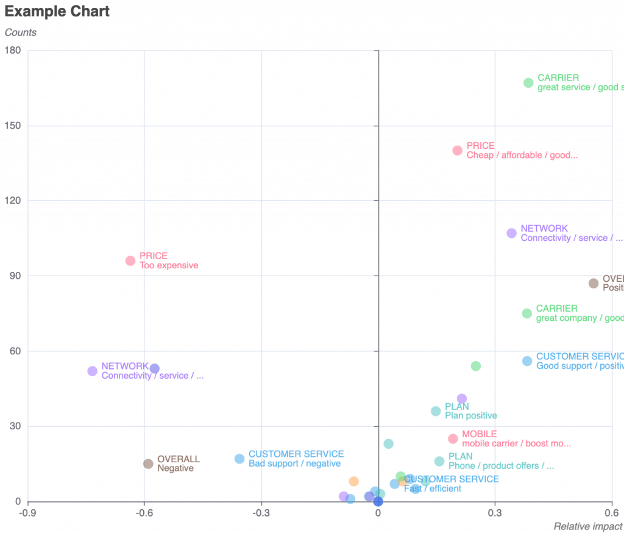
Driver chart showing codes, including customer service, price, network, carrier, plan, mobile, and the associated NPS score.
How To Read A Driver Chart
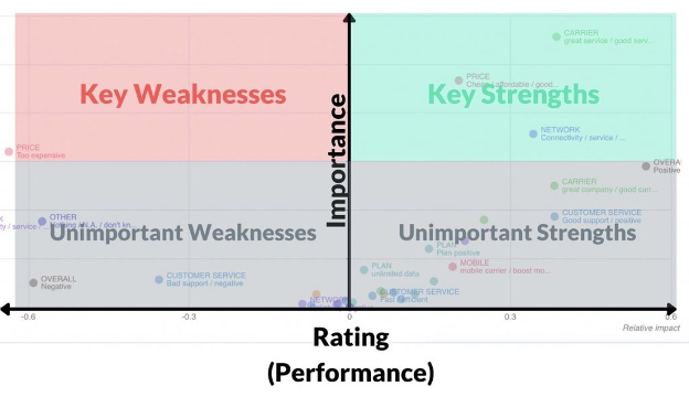
The graph above is an excellent way of showcasing how to best read a Driver Chart.
In Caplena, the vertical line (Importance) is placed in the middle, though, to equally split the chart into strengths and weaknesses.
The Driver chart is split into a quadrant with key and unimportant weaknesses on the left and key and unimportant strengths on the right.
Key Weaknesses 👎 Important but poorly rated. Values in the left-hand quadrant indicate drivers that affect the outcome metric in a heavily negative way.
Key Strengths 👍 Important and highly rated. Values in these quadrants indicate drivers that are substantial in determining a highly positive outcome metric.
Unimportant Weaknesses 😐👎 Not important and poorly rated. In the bottom left quadrant, these values indicate drivers that do not influence outcome metrics that much.
Unimportant Strengths 😐👍 Not important but highly rated. Drivers in the bottom right quadrant don’t influence outcome metric determination.
That’s it for today folks! It is our hope that you will be able to utilize the chart to your full advantage now. As always, don’t be a stranger! You can always count on the Caplena team to assist you with any questions you may have.
Related blog posts


5 Ways to Effectively Measure and Utilize NPS
Your customers have an enormous amount of leverage when it comes to your brand’s reputation. What they tell other people can expand your business quickly or destroy new growth. That’s why it’s so important to measure NPS (Net Promoter Score).


Customer Surveys: Open-Ended vs. Multiple-Choice Questions
How do you decide on what kind of survey to use? We’re eliminating some of the guesswork for you by giving you foundational advice to creating an effective customer survey, and a good old-fashioned comparison between open-ended vs. multiple-choice.


How to Ask for Customer Feedback – And Get an Honest Response
Customer feedback is about more than knowing whether your customers give your product three stars or five stars (although that is a valuable insight). It’s also about gathering the information that can help you make critical decisions and improvements….


Coop Case Study: Getting Actionable Insight From Mass Feedback Analysis
What do customers think about organic food? What do they like about the newly built store? Why do some customers feel 😊, while others feel 😩? These are questions that Coop, the Swiss Retailer wanted to find out!